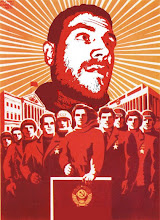
The last Illustration from this last semester, Joseph Conrad's The Secret Agent. It's just a coincidence the man on the cover resembles the previous painting below. They are not the same.
The very last in the series of childhood myths, its was done in illustrator which happens to be my favorite of the adobe programs. I was also going to post my final from Painting class but that will have to wait until next semester to get it back. But next year I will put up some of the projects I've been working on during break.
... don't let the bed bugs bite. I was always told this as a kid, so ya this ones personal. The scanned painting just doesn't do it justuce, I guess you'll just have to trust me on this one. Its acrylic on bristol paper.
Its time to play catch up now that this semester is over. I just shoved the blog aside to finish everything. It will not happen again.
So...
Second piece in the series of childhood myths. This one was first screen-printed on to different surfaces and then put back together creating this collage.
This semester I have chosen to do a body of work that deals with the myths your parents tell you as a child. To explore different mediums each project will be done with a different medium. This first one deals with the television and it's ability to rot ones brain if watched too long. I Painted it on wood with acrylics. The scanned painting is bigger than normal so be patient. I also included the initial drawing, its light and hard to see but I liked the set up and the direction of the lines. More of the series with follow as I complete them.
A recent graphic design assignment to "design the concept for a bakery." This is a bakery that caters to subcultures with quirkier interests. The class blog has all of our individual concepts up. Class Concepts
For an illustration class (already six months ago) the assignment was to choose a play and then make a poster for that play. I choose The Rite of Spring, a play with music by Russian composer Igor Stravinsky. The ballet is about the dance and sacrifice of a virgin (what the red represents) to the god of spring. I first started sketching with the idea of the poster being more representational and later stylized it to look like cave paintings. The title type face is hand made.
While sorting through old sketchbooks I came across this drawing. It's old as the date infers but since I haven't posted in more than week this will have to do.
The raised fist an iconic symbol of struggle, my sports a record. This was a stencil design for a digital tools class that was to combine my love for vinyl with communist Russia era art. It was cut out and sprayed, this is just the vector image of it.
I figure, I'd start posting older projects and play catch-up before posting recent work. Heres a screen-printed one color t-shirt I did a while back as a project for a Typography class. The text is taken from a song title from a band by the name of Dangers.
... from this primordial blog it is unknown what will fester and spill over first. I should have started this a long time ago, but on account of my procrastinating ways a blog has only been a thing I thought about doing. I have pushed it down my " list of items to do" long enough. My art gets its first true introduction to the outside world.